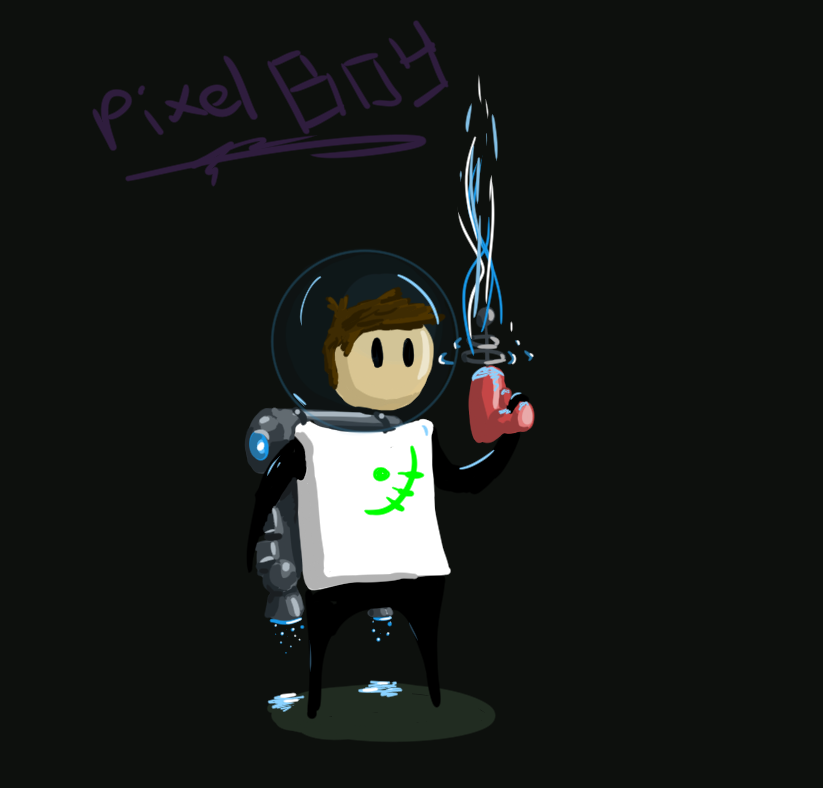
Pixel boy concept art.

The look of PixelBoy (no longer in pixels though). I am still experimenting with whether I should use traditional drawn art or pixel art. Especially since the market is flooded with pixel-art style games nowadays.
 Peter Verzijl

The look of PixelBoy (no longer in pixels though). I am still experimenting with whether I should use traditional drawn art or pixel art. Especially since the market is flooded with pixel-art style games nowadays.

For my student dorm, I created a clone of the Achtung die Kurve game in order to allow them to play on the couch with controllers a keyboard and even a mouse, which was not possible with other iterations of the same game. The game is sort of a combination between the older arcade game Tron and Snake, however, you are only allowed to move in curves. The curves also randomly break at certain intervals such that other players can move in between these sections. The game can be played with up to 6 others, but only if you have 4 gamepads, a mouse and a keyboard plugged into the same computer. The game is sectioned into rounds where the last player standing wins. The game becomes extremely chaotic and fun when you play with enough others.
The visuals of the game are inspired by the same visuals we used for the Vectro Wars game, with neon colours and an 80ties aesthetic. The game can be downloaded here and played here.

In March of 2015 I, together with Thomas Dijnum and Siewart van Wingerden participated in the 58th Mini Ludum Dare game jam. During this weekend long event, we created a game which was inspired by the game Pong (which was the theme of the game jam). During this game jam we created Vectro Wars where you need to defend your planet against incoming asteroids.
The game had two modes, a single player mode where you need to survive a selection of increasingly difficult levels; and a two player mode where you need to survive as long as possible by reflecting asteroids to your opponent while defending your own planet.
The main mechanic of the game was that incoming asteroids had to be bounced a certain amount of times before they would break apart and disappear. The asteroids are attracted by the planet’s gravity and would loop back after being deflected. By deflecting the asteroid closer to the edge of your deflection field, the asteroid would angle away from the panel. Allowing you to control where the asteroid would roughly land later.

Due to our team having three members, a lot of time could be spent on the look and feel of the game. We chose a very vector-like aesthetic, as the game was also based on the old asteroid arcade games which featured a vector based screen. To make the game more visceral we added chromatic aberration vibrations to the screen when hit, to make sure that the player would know when he or his opponent was hit. Screen refresh waves, CRT-like curvature and lots of noise were added to give the player the idea that he/she was playing the game on a very old arcade machine.
Later on the game also featured upgrades which would double the amount of paddles, change the width of the paddle or change its speed.
The game can be played on its Ludum Dare page here. The game was well received and even got featured in a video on youtube which you can enjoy below!

On the 16th of July Mark Brown from Game Makers Toolkit (GMTK) hosted a game jam based on one of his famous video essays. The particular one which was chosen as the basis of the game jam was the one where he talks about elegant game design. In this video, he references a quote from Shigeru Miyamoto which encompasses his thoughts on what elegant game design is: “A good idea is something that does not solve just one single problem, but rather can solve multiple problems at once.” Based on this premise we (Kylian Rijnbergen and me) created Shooting Stars.
During the brainstorm of the game, we came up with all kinds of ideas which combined game mechanics. We eventually settled on a game where you shoot to propel yourself where you would move into fields which would boost your ship’s abilities. We created fields which increased shooting power, and thus acceleration; a field which boosts shield, and also increases the mass of the ship, and one which increases fire rate, and thus the ability of the ship to change direction. Would the fields overlap, then the buffs would stack.

The scope of the game, in the beginning, was quite big. We wanted the player to be able to choose from multiple ‘missions’ which would utilize some of the fields better than others. The fields would also stack on the ship’s base statistics, therefore some ships would be better for some missions. However, later in development, it became clear that there would not be enough time for the implementation and testing of the levels, therefore the level mechanic was dropped in favour of polishing the main mechanics. In its place, multiple enemy types were created to force the user to switch fields. The enemies created were a tough dreadnought which would fire a plethora of high damage seeking missiles, a fighter which would hone in on the player and fire and finally a kamikaze ship which would ram into the player.
The game was created by Kylian Rijnbergen and me in Unity3D and can be played here, and there is also an itch.io page.
The game lacks a proper goal and would probably have been better if it were level based. In that way, the player could have learned how the fields influence the behaviour of the ship and the game could have been learned more naturally. Now the effect of the fields is somewhat hidden to the player and not well explained. Each level would then also have been tailored to the behaviour. In this way, the player would also have been able to fail more often. In this structure, the fields would also have to move around and the player would have to manoeuvre within a tighter space in order to keep the experience tight. This would also solve the lack of goal problem. Reaching the final level would then be the goal.
Another problem is that the ship is quite hard to control at higher speeds. This could be improved by multiplying the ship’s velocity with some constant in ratio the difference in the direction where the player wants to move. Allowing the ship to make quicker turns. This is an easy fix.
The speed of the ship is very satisfying however, it is a blast to control and the enemies have good veriety. There are some redeeming qualities which could be used in other games/prototypes, but this is definitely not the best prototype game I’ve made.

For Ludum Dare 36 I created a game called ‘Circle of Fire’. The theme of this jam was to create a game with ancient technology. As I did not have a lot of time this weekend, I decided to not make something with ancient technology, but to feature the oldest technology I could think off and make that the main game mechanic.
The oldest technology, of course, is fire. I thought of a game in which you need to control a fire in the early stages of civilization. The goal of the game was to make sure that the fire would stay within the fire pit and prevent the fire from ruining the village huts.

You control the fire by moving water filled canisters which spawn on the docks to the heated tiles on the floor. The temperature can be seen by how red the tiles are, the redder the tile, the more heat is concentrated on that tile. The hotter the tile, the easier the grass catches fire. Sand paths don’t’ catch fire, but transfers heat much easier. If one of your huts is still standing after the level timer finishes, you have completed the level.
The game can be played and downloaded here.
The mechanic of the spreading fire was the hardest to get right. The amount of heat transference and the time it would take for grass to light on fire took the most time to balance. In the end, it spreads nicely. However, due to this taking so much time, the mechanic of taking heat away is not very well executed. Right now the only tactics the game requires is to walk as fast as possible between the docks. The game would be much more fun if the player had to choose between multiple ways of cooling down or redirecting the fire. For example, wood could have been added to redirect fire somewhere away from the huts.
The game would be much more fun if the player had to choose between multiple ways of cooling down or redirecting the fire. For example, wood could have been added to redirect fire somewhere away from the huts. Another idea was to let the player dig holes in the ground, to stop the heat from spreading and could have been used to dig canals of water. Another idea was to give the players just one bucket and let them choose for themselves where to get the water from. Now there is a time where the player is just waiting for the buckets of water to respawn, which is not all too compelling.
The decision to use text files as levels did make it much easier to quickly design them instead of using Unity’s own scene manager. Levels could easily be changed during gameplay and copy-pasted into new files. I have used this technique a lot in the projects hereafter.
The game got four comments from players on the Ludum Dare website which were mostly positive. Two remarks were made, one on the lack of strategy as addressed in the last section and one on the lack of sound-effects. Both are very valid and would add a lot to the fun-factor of the game. The visuals were liked a lot.